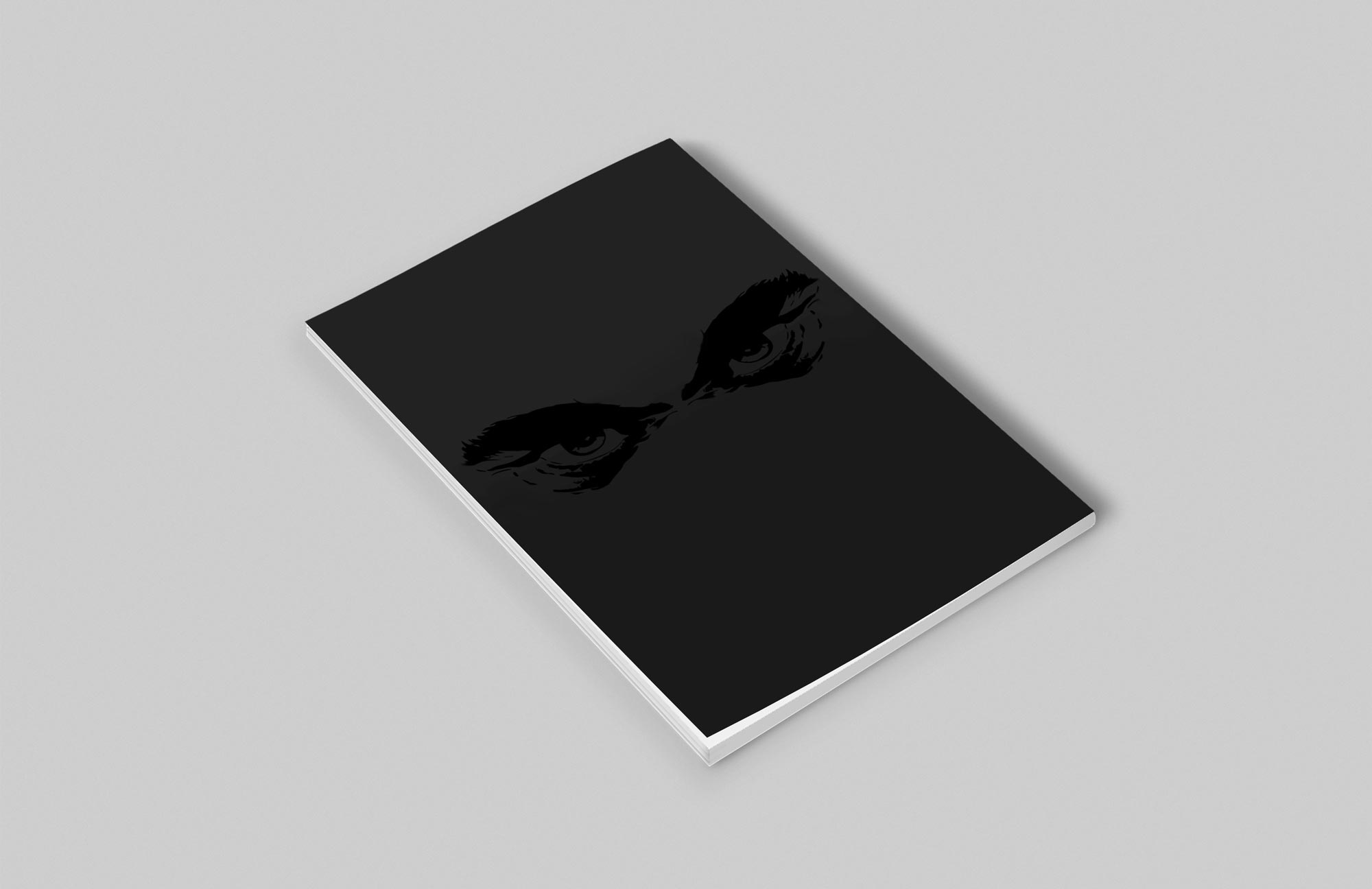
Being subscribed to Game Informer and Nintendo Power in the late 90s and early 2000s, I always had a problem with the way the magazine was laid out. The content was all packed up together, the information was cool because of the content but visually it was a mess. My goal for this project was to create a gaming magazine with clean aesthetic as opposed to being all cluttered.
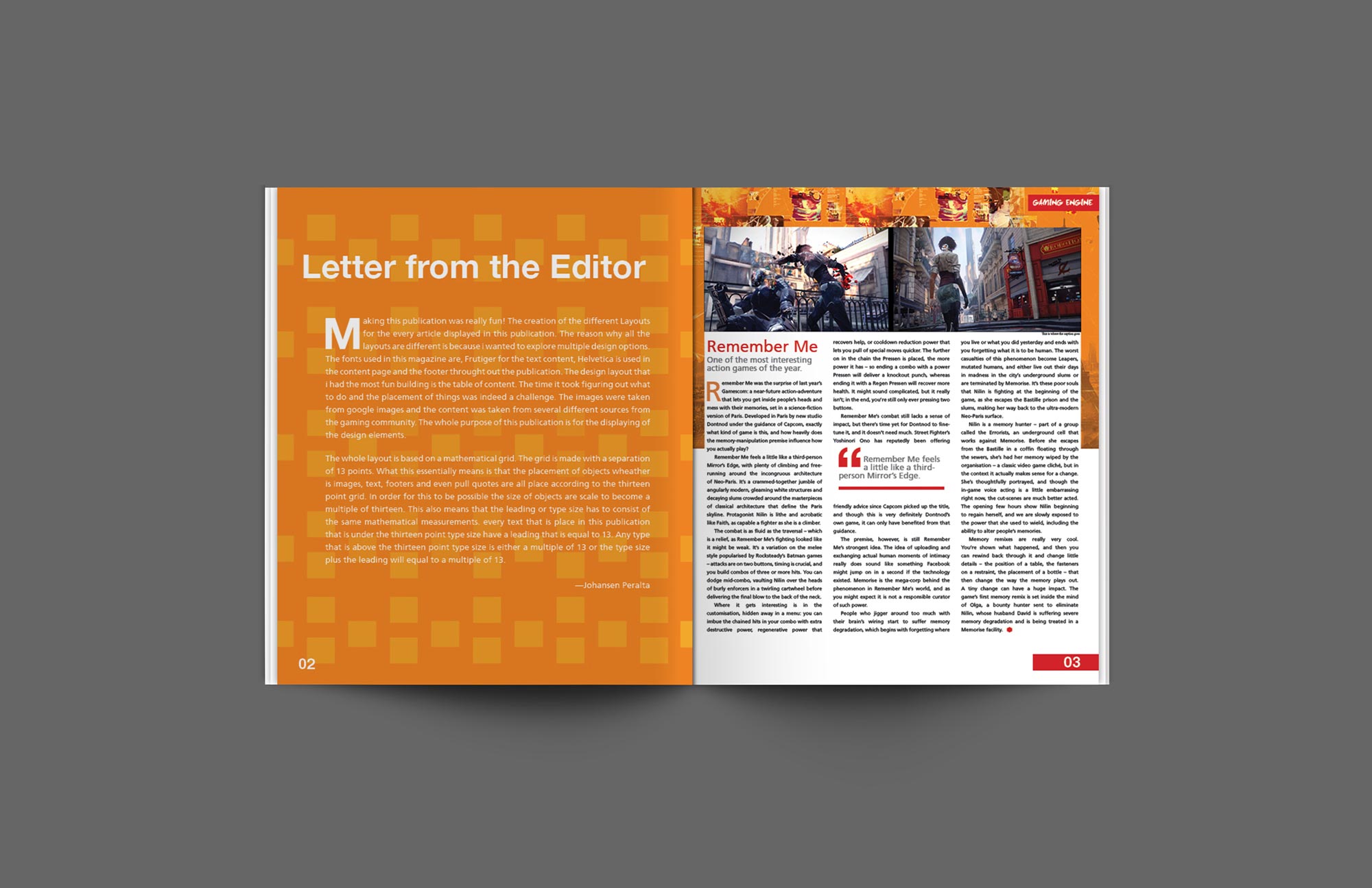
Working on this project was so much fun, there were so many different layout Ideas that just making one spread was not enough, that was when I decided to do a full magazine instead. Using the grid layout design that was centered around the spacing of 13 points. That meant that everything that had to do with spacing whether it was the type of images at least 13 points or a multiple of 13 points.