ART DIRECTION
LAYOUT
concept
design
illustration
At Aetna, health care isn’t one-size-fits-all, it’s personal. Whether it’s helping you prepare for a heat wave, checking in on your wellness, or simplifying your Medicare options, we’re here to make care feel human, connected, and compassionate.
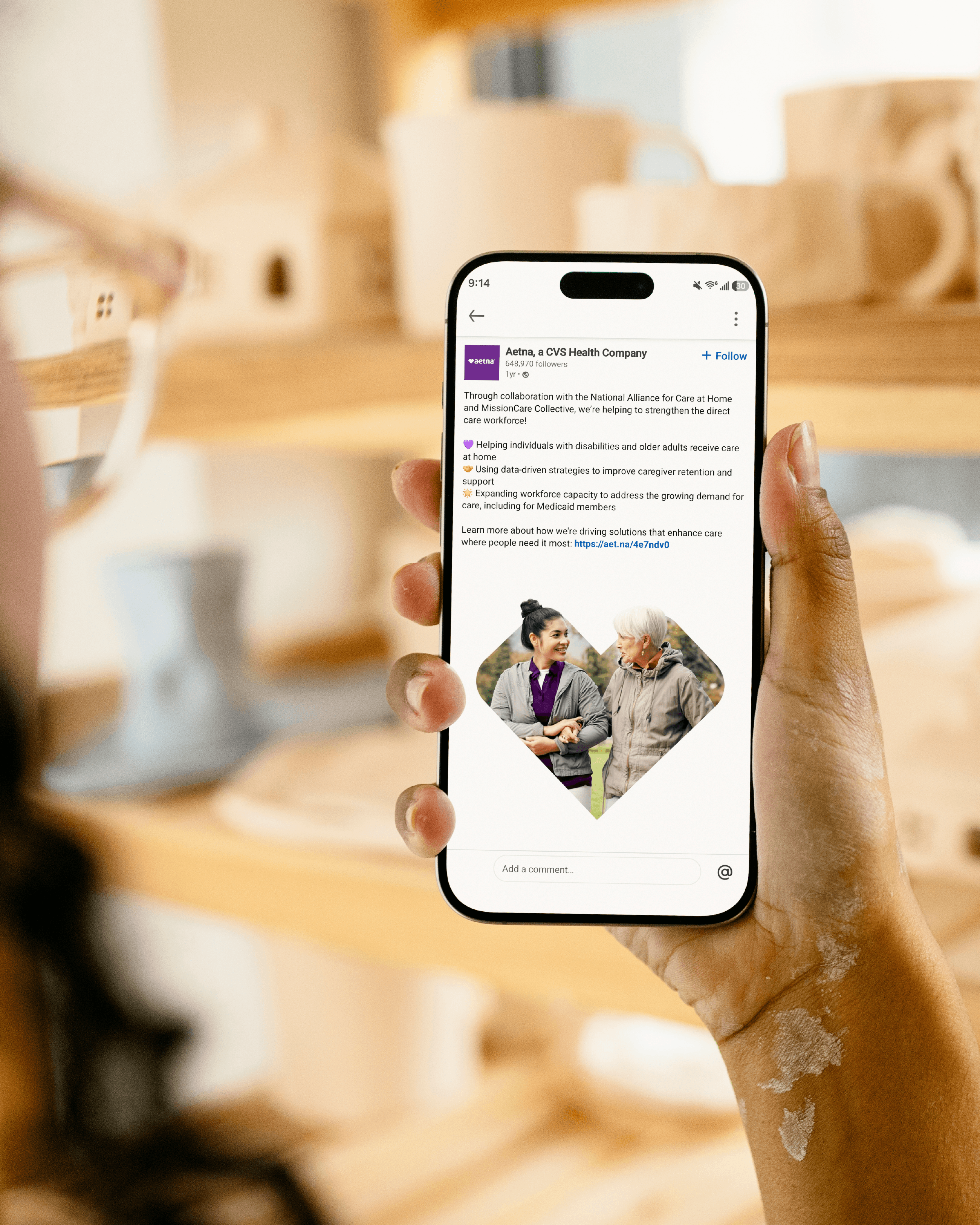
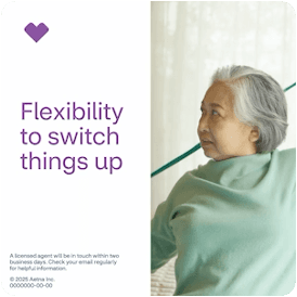
Our latest creative branding exploration brings Aetna’s mission to life through a design system built on empathy, simplicity, and connection. Heart iconography anchors every layout, its a universal symbol of care, turned graphic signature. It weaves through the work as a unifying thread, from illustrations to photography frames. Typography and color are clean, clear, and purposeful. Lavender tones signal warmth and trust, while white space invites calm and ease.
This is design built not just to look good, but to feel good. Because at Aetna, care isn’t just the message. It’s in the details.